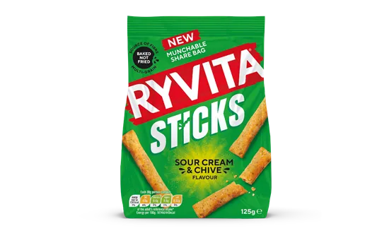
Backed by more than a century of brand recognition, Ryvita Sticks needed to enter newer consumption occasions without losing its distinctive identity. The updated approach therefore combines familiar Ryvita cues with a brighter, more contemporary presentation designed for today’s shoppers.
According to the brand, the packaging uses vivid colours, large-scale product imagery and straightforward flavour and texture messaging to strengthen shelf appeal. This approach reflects current food and drink packaging and food and drink marketing priorities while ‘staying true to Ryvita’s health credentials’.