


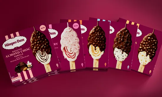
The new identity was developed to communicate the product’s depth, indulgence and intensity immediately, reinforcing its position within evolving food and beverage industry trends.
Premium typography now distinguishes each flavour, while vertical bands organise the range and improve visibility on shelf. The refreshed food and drink packaging uses a cleaner layout, creating more room for appetising product imagery and clear ingredient cues. A distinctive ice cream form, derived from the brand logo, further strengthens recognition across the portfolio.
Every visual element works together to express the product’s superior quality and the rich, desirable character associated with the Häagen-Dazs experience. This approach also reflects changing food and drink consumer trends, where premium presentation and transparent ingredient communication play an increasingly important role in purchase decisions.
The ingredients received particular attention. A dedicated photography shoot placed them against a burgundy background, a colour closely linked with Häagen-Dazs. The result highlights the brand’s commitment to quality while demonstrating how food and drink packaging can combine strong brand codes with an elevated product presentation.